I asked for ideas on the first post because I wanted to avoid people going ahead and working on finalized designs before we know what we actually want. Now some people have submitted ideas and others have submitted designs.
From the links that I can open, I got the following designs and my opinion on it. I try to keep this as generic as possible so that we can narrow down on a general design instead of talking about something too specific.
- Azkedar:

I like that it’s easy to see and recognize from far away (what and Icon should be). I am a bit torn on the details because it looks a bit like a patchwork. I would think we should have something that is even easier to recognize and looks a bit cleaner than that also for the pattern/fill. - Ktechwhiz:


I like the idea of an open chest as a main logo. I am however not so sure what could be coming out of the box and the background since white might look funny on the server list background. - Silver82:


If we put writing like that on the logo, I think it should be better readable. I also think we need a something more unique or story-telling than the blocks or the mirrored U as a main object in the logo. I like the round text around it since it gives some shape to it.
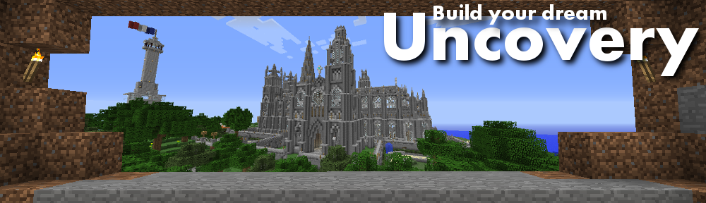
As a summary, I would say that either a “U” to symbolize “Uncovery” or another distinct object/background to symbolize an Uncovery (like the chest) is a good thing to start on. I would not want to put too much text on it for now since the “Uncovery Minecraft” already will be on the server list next to it. “Build your dream” can be on it if it fits well on the logo and is easy to read. Comments, opinions?
Personal favorites of these designs are Azk’s stylized U and silver’s (last one) multi-block with ‘build your dream.’
I like AZK’s but maybe in a solid like gold, red stone block, or lapis block. Or even glow stone.
No!!! Not Lapis! (Inside joke) To be honest, I personally love silver’s 2nd to last one, the diamond block looks sharp, I also thought maybe a rough silhouette of the City’s skyline or some well recognized contour of a build on the server.
With it only being 64×64 it will be extremely hard to add any building or City skyline in.
Silver’s first emblem or last emblem.
http://i.imgur.com/h28YuyL.png
Silver, you’re pretty good at this design stuff. TEACH ME.
Thank you, though I’ve never done any design work before this so I’m in no position to teach. Everything I know is from messing around, reading lessons/tutorials, and watching how-to videos on youtube. If you don’t have access to Photoshop, use Gimp. It’s free, and you can do just about anything with it for basic image creation and editing.
This looks nice! Can the chest be open a bit? to tempt people to look inside?
Sure thing. http://i.imgur.com/i4hCejC.png
I think it may look better if it was mirrored. The chest going the other way so it would point towards the server name.
http://i.imgur.com/XEnbCFM.png
Yes, that one looks better in my opinion.
http://i.imgur.com/rkCHnEr.png
Fixed – http://i.imgur.com/NfBqzTC.png
Wow the one with the chest in a circle looks AMAZING
Teach me your ways oh wise one